Interface and Layout
General View
All tables have a standard appearance and a mixed creator-user interface.
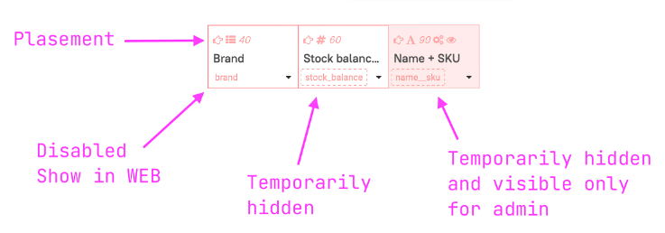
Placements
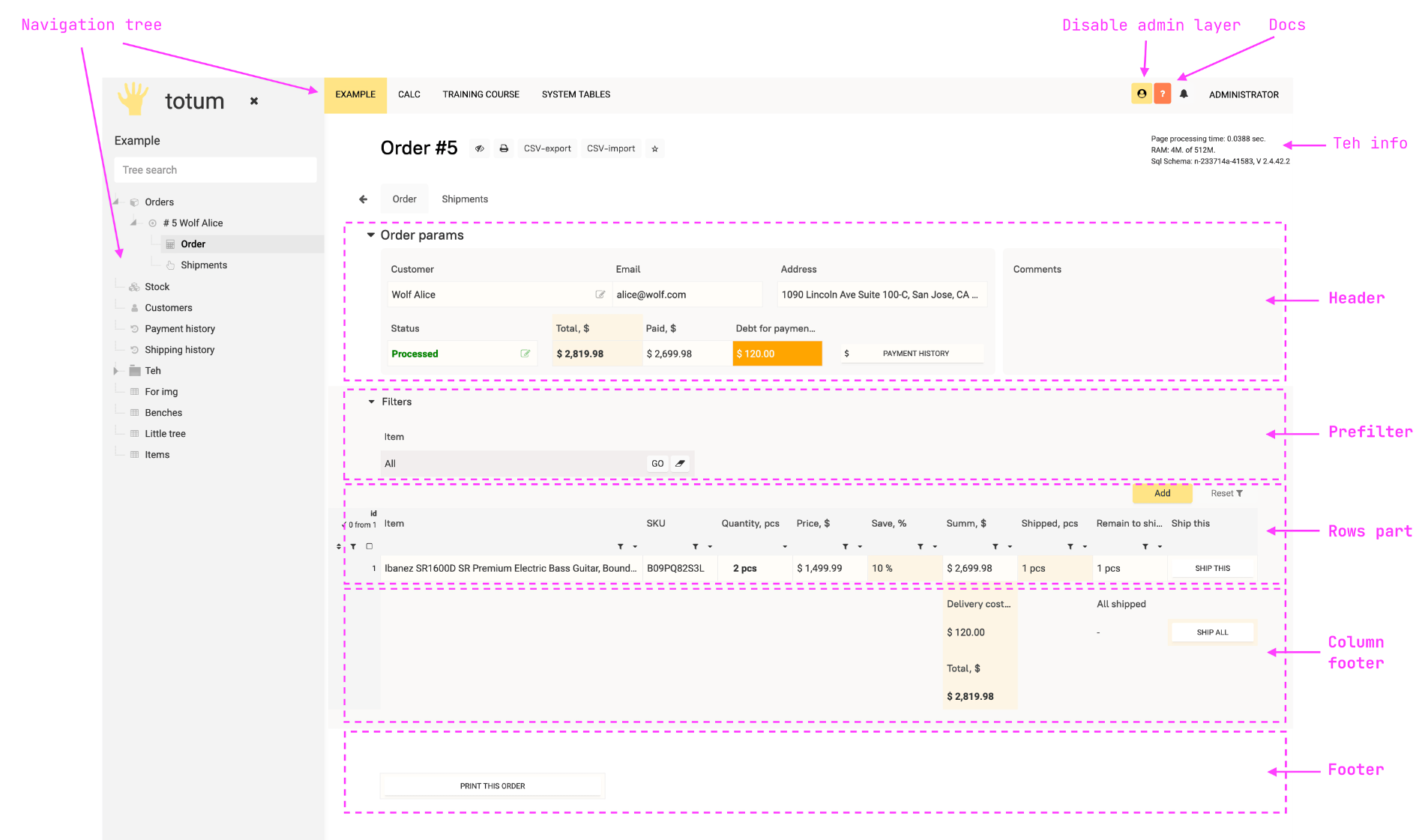
Tables have 4 basic placements for field placement image 👆.
Header — located after the table title. Fields automatically move to the next line when the window size is reduced.
Prefilter — defines the filtering conditions for the Row part values passed to the user's browser.
Row part — can have many columns in width, for horizontal scrolling use
click-and-dragwith the left mouse button.Footers
- Column footers — located under the corresponding columns of the row part.
- General footer — located after the row part, functionality is similar to the Header.
A particular placement may be absent depending on the type of table:
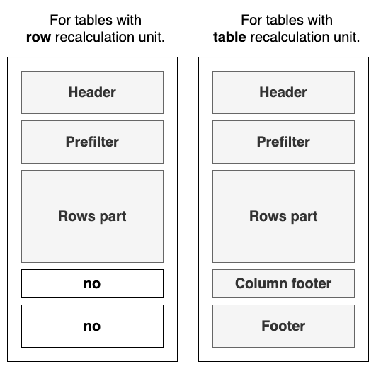
There is an exception: in calculation tables it is possible to use a prefilter. When using it, the table is still calculated entirely, but the rows of the row part are passed to the client according to the filtering conditions.
Placements not only determine the position of fields in the interface but also the order of their value calculation.
The order is similar to the placement in the table: Header —> Prefilter —> Row part —> Column footers —> Footer.
Access to table settings
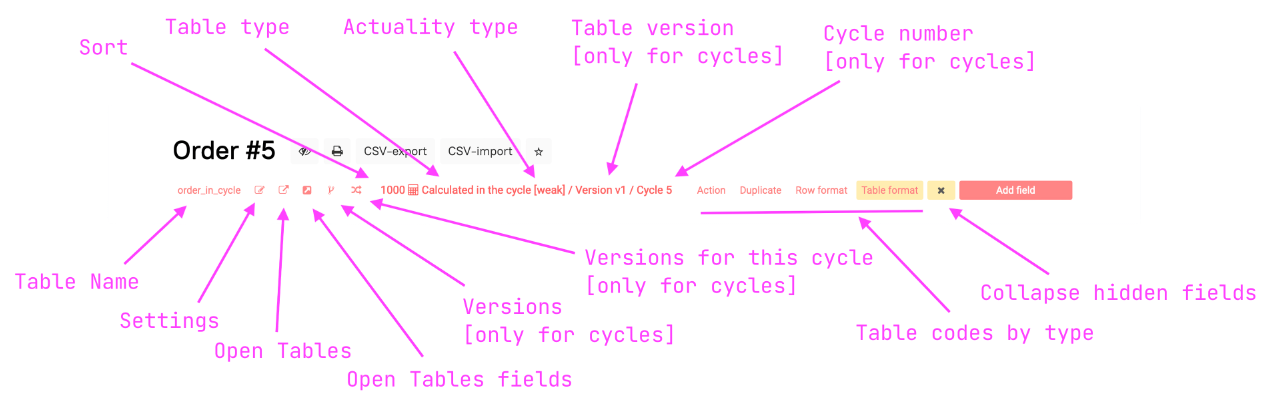
Clicking the left mouse button on the table name saves it to the clipboard.
Navigation Tree
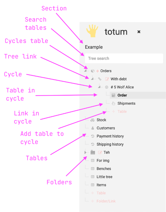
The navigation tree is displayed as a top menu of categories and a left column. The column with the tree can be hidden.
Tables can be attached to the tree, or for calculation tables in cycles to cycles.
Tables are shown according to their sort number. It is possible to hide a table from the tree for everyone or only for specific roles.
In addition to tables, the Tree can include:
Links to URLs
Shortcuts to tables
View Settings
Users and the Creator can customize and save display views of fields that are convenient for them.
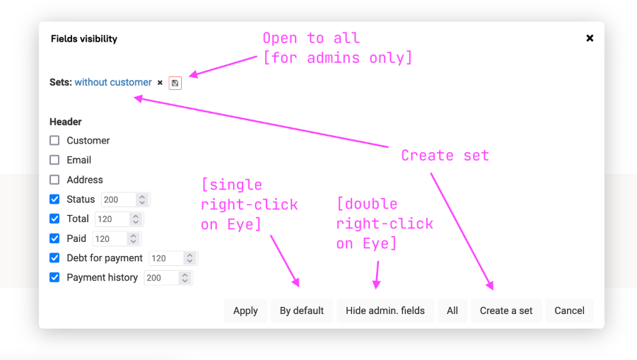
Individual field settings are saved for the user-browser pair.
The Creator has the ability to convert their personal settings into public ones (stored on the server).
A single right-click on the eye brings up the
defaultview.A double right-click hides fields visible only to the Creator.
Field settings are manually edited in the table parameter field sets.
Field Settings Editing
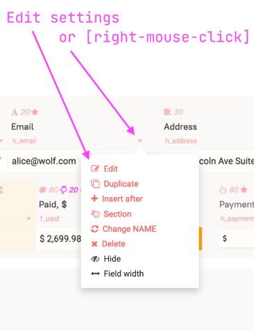
Duplicate — opens the editing panel in field addition mode, inserting the current field's settings.
Insert After — opens the field editing panel in new field addition mode, filling the current table, placement, sorting (
sort+10). Upon successful addition, shifts the sorting of all subsequent fields in the placement by+10.Delete — initiates a field deletion timer.
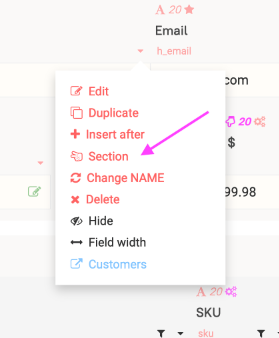
A quick way to open the field editing panel is to right-click on the dropdown menu icon.
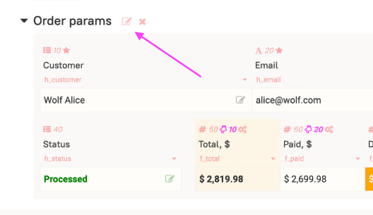
Section Assignment
Sections allow you to structure the interface in the header and footer.
Fields within sections can be grouped into blocknum groups with their own numbers.
If the screen width is insufficient, fields will wrap within the group.
Fields can be forcibly wrapped using the nextline: true parameter.
The fill: true parameter will fill the field widths to match the width of the widest line when automatic wrapping is present.
Section Control
Section settings are stored in the header parameter as a string and are only applied when the new line parameter is active in the first field of the section.
If the field is disabled in the show in WEB parameter, the section parameters are disabled.
When the field is hidden through the eye, the section parameters are not disabled.
If the field has new line active but the header is disabled, the field will be displayed on a new line and will inherit the parameters of the previous section. Unlike the nextline: true function setFloatFormat, the field will be separated from the group even if it has the same blocknum:.
Section Settings Syntax
**— initialize the start of a line with section parameters.:— separates the parameter and its value.,— separates group numbers and field names when listed.;— separates parameters.Section Header**param_1:blocknum,field_name:value;param_2:blocknum,field_name:value; Section Header**plate:1:yellowgreen; -- assigns the color yellowgreen to group 1's plate
Creating, Editing, and Deleting Sections
Section Parameters
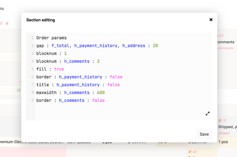
The first line is always reserved for the section name. If you want the name to be empty, leave the first line blank.
label:
false— hides the section header.gap:
10— adds spacing between fields in the section.gap:
1,2,fieldname1:10— changes spacing in specific groups and fields.title:
falseortrue— mode in which field names are hidden.title:
1,3,fieldname1:falseortrue— only for specific group numbers and fields.border:
falseortrueorcolor— assigns a border and standard background to the field. Processes/.border:
1,2,fieldname1:falseortrueorcolor— for specific groups and fields. Processes/.plate:
falseortrueoryellowgreen— replaces the plate color or cancels it if false is passed. Processes/.plate:
1,3:falseortrueoryellowgreen— for specific groups. Processes/.outline:
trueorfalseoryellowgreen— adds an outline for all groups. If a color is specified, then with color. Processes/.outline:
1,2:trueorfalseoryellowgreen— for specific groups. Processes/.plateh:
400or80vhorfalse— sets the height of all groups. Processes/. Can useCSS calc.plateh:
2:400or80vhorfalse— sets the height of a specific group. Processes/. Can useCSS calc.platemh:
400or80vhorfalse— sets the maximum height of all groups. Processes/. Can useCSS calc.platemh:
2,3:400or80vhorfalse— sets the maximum height of specific groups. Processes/. Can useCSS calc.
In border, plate, outline, plateh, and platemh, you can specify a value through / — the value before the slash will work when there is no group wrap in the section due to insufficient screen width. After the slash — when there is a wrap.
For example: plate: 1 : false/true — before the wrap, the plate will be hidden, after wrapping at least one group — shown.
Analog of setFloatFormat:
blocknum: — a number that determines the group number to which the field will be assigned. Fields in groups are glued only if they are located next to each other. If you assign the same number to two separate fields, these will be two different groups with the same numbers.
nextline: — if true, the field will immediately be moved to the next line in the group.
maxwidth: — a number, if specified, determines up to what width in px the field will expand if the screen width allows. If several fields in one line have this parameter, they will expand proportionally to their base width set in the field settings.
fill: — true, if specified, the field will expand to the maximum possible width of the block defined by the widest line.
height: — a number, the height of the field in px. If specified, the field height will differ from the standard. The display of the field content also changes.
maxheight: — a number, the maximum height of the field in px. If specified, the field will determine its height automatically depending on the content. But not more than the specified maximum height. Can be specified in vh and css calc.
glue: — true, glues the field to the one on its left. Glued fields will be transferred together. At the minimum screen width, they will not be transferred.
breakwidth: — a number, determines the width at which the field will be transferred. If not specified, the transfer will occur only when the field reaches the default width.
Additional block management:
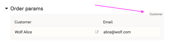
blocktitle: — sets a name for the group displayed in the upper right corner of the plate.
titleleft: —
100or20%. Places the title to the left of the field, not above.
titleright: —
100or20%. Places the title to the right of the field, not above.platemaxdiff:
200— sets for all blocks the rule of transferring the block to the next line when the height difference between the current and previous blocks exceeds the specified value in pixels.platemaxdiff:
2,3:200— sets for the specified blocks the rule of transferring the block to the next line when the height difference between the current and specified blocks exceeds the specified value in pixels.
PRO Panel View
Only in the PRO version
If the panel view parameter is filled, the table will be displayed as panels.
Which fields are included in the panel can be configured.
Panels can be dragged if the sort by order field parameter is enabled.
Pagination does not work in panel and kanban view!
The view does not work on mobile devices! There, the row part is displayed as a table.
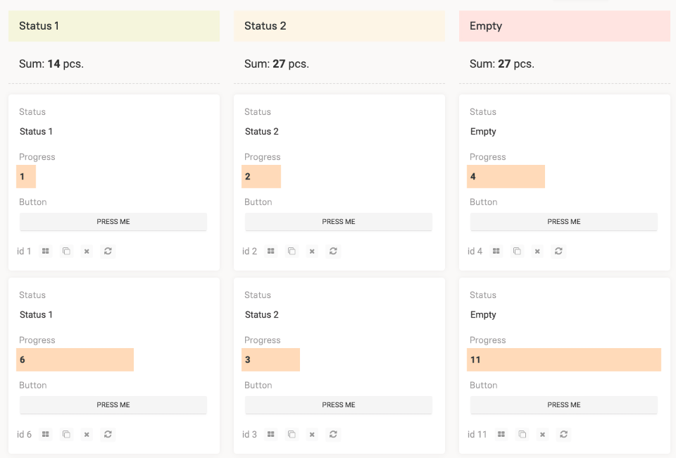
PRO Kanban
Only in the PRO version
If a select is chosen in the kanban-field, its values will be divided into columns.
The order of the columns will correspond to the order parameter of the selectRowListForTree function in the select field.
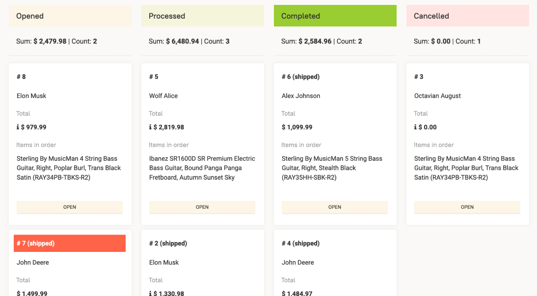
Dragging from column to column will be available if the user has edit access to the select field chosen as the kanban-field.
The select can also be calculated based on header fields or prefilter. This way, you can get a different set of columns for different users or depending on other conditions.
Different sets of values for different rows will not work.
Panels can be colored — parameter h_kanban_colors:
{
"1": "beige",
"2": "oldlace",
"": "mistyrose"
}
Also, HTML can be calculated for each column. Parameters: h_kanban_html_type, h_kanban_html_height, and h_kanban_html_code, which receives the variable $#kanban containing the base of the kanban-field for the column:
=: str`"<div style='font-size: 16px'>Total:<b>" ++ $summ + "</b> pcs.</div>`

summ: listSum(list: $list)

    list: selectList(table: 'panels_view_test'; field: 'spent_num'; where: 'status' = $#kanban)
The view does not work on mobile devices! There, the row part is displayed as a table.
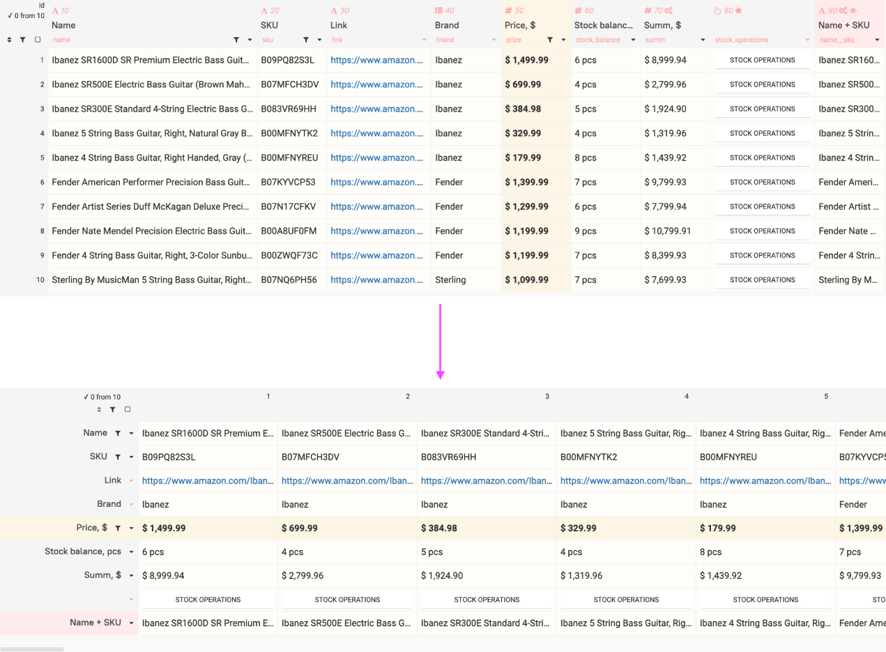
PRO Table Rotation
Only in the PRO version
If the table has the column width on rotation parameter set, the rows will be displayed as columns with the specified width.
Column headers will be displayed if the table has a main field selected.