Field Types
String
Small strings.
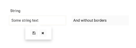
Stores a string value of any length or null.
Displayed as a simple string in the field. The displayed length is truncated depending on the set field width.
Fully transmitted to the client, so for storing large string data, it is recommended to use the Text field.
Features and settings:
Number
Storage of numbers.
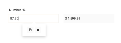
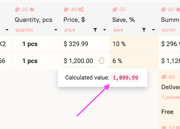
Stores a decimal number with a specified number of decimal places (up to 10) or null. If the result of calculations has a tail longer than 10 digits, the extra digits are discarded without rounding.
Displayed as a numeric value in the cell. The standard decimal separator is
.When the currency format parameter is enabled, it is displayed with a decimal separator and thousand separators depending on the selected type.
Edited with a simple input field that restricts non-numeric values. It is possible to enter
,or.for fractions.When editing, you can specify a change relative to the previous value:
+1— increases the number by one.+-1— decreases the number by one (if you set-1, the negative number-1will be saved).*2— multiplies by 2./2— divides by 2.+2%— adds 2% (%can be used in all the listed operations).
When changing the field value through the set and setList functions, mathematical operators can also be used.
// In the table table_name, the value of the numeric field number_field in the row with id = 1 will be increased by 2:
example1: set(table: 'table_name'; field: 'number_field' + 2; where: 'id' = 1)
// In the table table_name, the value of the numeric field number_field in the row with id = 1 will be increased by 2%:
example2: set(table: 'table_name'; field: 'number_field' + 2%; where: 'id' = 1)
Features and settings:
Maximum 10 digits after the decimal point! All digits beyond this will be discarded without rounding (cut).
If a number in exponential notation
2,3e+15comes from an external system, it is converted to the totum format by the numFormat function. The maximum size of such a number before the decimal point is 17 digits (including intermediate calculation results)! If exceeded on a 64-bit machine, the final result will be a random number.
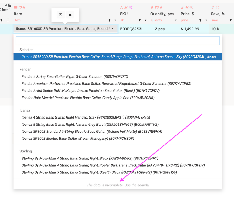
Select
Fields linking tables. The cell stores an id or code value, the display of which is stored and changed in the source table.
You can also use your own key-value pairs with Manual select creation (values)
The result of the selectRowListForSelect function is a list of associative arrays in the form:
[{"value":45,"is_del":true,"title":"Material procurement and warehouse"}}]
Where:
value — the value of the element.
is_del — whether the element is deleted (if true, it is crossed out in the interface, optional parameter).
title — the displayed value.
From the select code section, you can return a list of this type (is_del can be omitted) and the select will be built based on the provided data.
Content:
A string value of any length or null for a simple select.
List or empty list (for multiselect). Can be null in the case of an uncalculated row of a simple table when adding a field.
In the web interface:
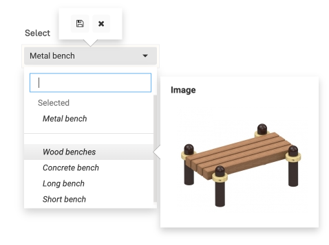
Displayed as a string, enumeration, or the number of selected items.
In the admin interface, you can view the basis or key at the bottom of the pop-up panel by right-clicking in the field.
Search modes work for value searches search modes.
Features and settings:
When selecting rows in select functions select, selectList, selectRowList, etc., in where: you need to substitute the key value, not the display. Similarly for order:.
Unit of measurement (unitType).
Maximum number of displayed items (selectLength).
Select code (codeSelect).
Individual select calculation for each row (codeSelectIndividual).
Multiple values (multiple).
Print the full text (printTextfull).
Display of multiple select in the cell (multySelectView).
Select header with empty value (withEmptyVal).
Select table for modification (selectTable).
Select panel for modification (selectTableAction).
Manual select creation (values).
When using select in a filter:
All (*ALL*) (selectFilterWithAll).
Name for the All (*ALL*) option (selectFilterWithAllText).
None (*NONE*) (selectFilterWithNone).
Name for the None (*NONE*) option (selectFilterWithNoneText).
Empty () (selectFilterWithEmpty).
Name for the Empty () option (selectFilterWithEmptyText).
Select-Tree
Fields linking tables. The cell stores the id, the name of which is stored and changed in the source table.
Data in the source table must be organized in a hierarchical structure, with a field storing the id value of the parent row or null if it is a top-level record.
The Name of this field is recorded in the parent: parameter of the selectRowListForTree function.
The result of the selectRowListForTree function is a list of associative arrays of the form:
[{"value":45,"is_del":true,"title":"Procurement of materials and warehouse","parent":"35"}}]
Where:
value — the value of the element.
is_del — whether the element is deleted (if true, it is crossed out in the interface, optional parameter).
title — the displayed value.
parent — the
valueof the parent element or null if the current element is top-level.
From the select code section, you can return a list of this type (is_del can be omitted) and the tree will be built based on the provided data.
Content:
A string value of any length or null for a simple select-tree.
List or empty list (for multi-tree). It can be null in the case of an uncalculated row of a simple table when adding a field.
Web Interface:
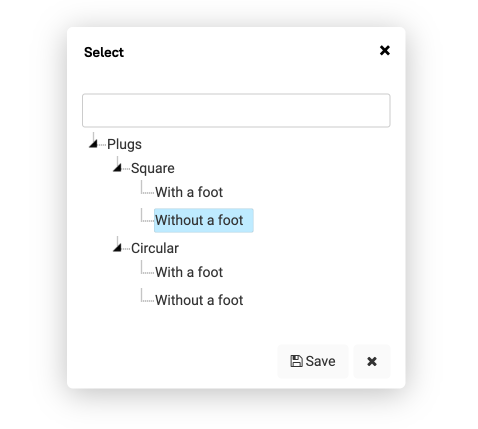
Displayed as a string, enumeration, or the number of selected elements. It can also display the paths of selected elements.
Editing is done by selecting elements in a pop-up window.
In the admin interface, you can view the base or key at the bottom of the pop-up panel by right-clicking in the field.
Search modes work for finding values search modes.
Features and Settings:
Tree calculation is a resource-intensive operation. Do not create a tree from tables with more than 2,000 elements!
Individual select calculation for each row (codeSelectIndividual).
Multiple values (multiple).
Print the full text (printTextfull).
Display multiple select in the cell (multySelectView).
Display the path in the cell (treeViewTypeFull).
The tree is built from one table (treeAutoTree).
Folders can be selected (treeSelectFolders).
Select header with empty value (withEmptyVal).
Select table for modification (selectTable).
Select panel for modification (selectTableAction).
Checkbox
A checkbox field. Stores values of type true or false.
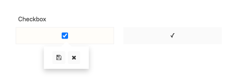
It can be in three states:
null— not filled.true— ✓false— -
Web interface:
- Displayed in a cell as
✓or-.
Features and settings:
- Cannot be assigned a value of
nullor any other value excepttrueorfalse.
In the row part of tables with a row recalculation unit, when adding a field to the database, the value false will be assigned to all rows of the table. If you need to avoid this and add a field with the value null, first add a field of type String, and then change it to Checkbox.
Date
Stores date and time.
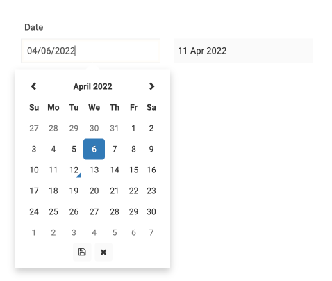
Stores date in the format Y-m-d (e.g., 2018-12-31), date-time in the format Y-m-d H:i (e.g., 2018-12-31 23:59), or null.
Displays in the cell as
d.m.y/d.m.y H:ior as specified in the date/time output format in the interface.Edited via the
datetimepickerwidget or by directly inserting the desired date/time into the input field in the specified format (input without punctuation marks is possible).The value can be cleared by erasing the data in the input field.
Features and settings:
When searching by the date field in select functions, the search string must be converted to the format in which the field stores dates (Y-m-d or Y-m-d H:i). Dates are compared and sorted as strings.
Date-time (dateTime).
Date/time output format in the interface (dateFormat).
Button
An active button element to trigger action code.
Displayed as a button.
Value editing is not available.
Features and settings:
Button text (buttonText).
Action available in view mode (pressableOnOnlyRead).
Uncheck after execution (uncheckAfterClick).
Close window after execution (closeIframeAfterClick).
Link
Duplicates the donor field for quick data display. For example, for outputting field values from within a cycle in a cycle table.
For cycle tables, the reference from a row goes to the corresponding cycle.
Features and settings:
linkTableName (linkTableName).
linkFieldName (linkFieldName).
The Link field type is recommended to be used only in cycle tables to quickly fetch data from fields within the cycle.
It is highly recommended to avoid using links elsewhere.
Do not use references to the row part.
Do not use from within a cycle to reference the parent cycle table.
Be careful — it is very easy to create a loop in the system.
Text
String values utf-8. It is possible to store significant amounts of data with line breaks.
Stores a string value of any length or null.
Displayed as a string in the cell.
Partially transmitted to the client when the page loads. Full text loading occurs when the panel is called by right-clicking or the edit window is opened.
Edited depending on the selected type by the
CodeMirroreditor (for most types with syntax highlighting) or thejsoneditor.
Features and settings:
Text type (textType).
Text visibility limitation in web (viewTextMaxLength).
Print the full text (printTextfull).
Comments
A dialog field that marks the date-time and the user who left the entry.
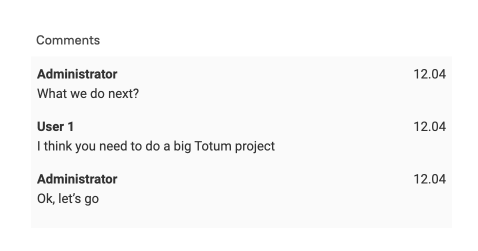
Designed for exchanging short comments with an indication of the users who left them.
Contains a list of lists with comment data.
Using action-code, you can:
Add an entry from the current user:
example1: set(table: 'test'; field: 'comment' = "Test comment"; where: 'id' = 3)
Completely overwrite the comment list:
example2: set(table: $#ntn; field: 'h_comment' = $list)
list: listCreate(item: $listComment1; item: $listComment2)
listComment1: listCreate(item: "2019-12-12 12:12"; item: 1; item: "Comment 1")
listComment2: listCreate(item: "2019-12-12 12:13"; item: 1; item: "Comment 2")
In case of overwriting with a change in the number of entries and dates in the past, the read messages mechanism will not work.
Web interface:
The field is displayed as a string.
Partially transmitted to the client when the page loads. Full text loading occurs when the panel is called by right-clicking or the edit window.
The last comment is shown in the field.
In the panel and edit window, comments are arranged in top-down order.
If a comment is unread by the user, it will be underlined with the Highlight Color.
The read status is assigned to the cell when it is opened for editing or the panel is called by right-clicking.
Features and settings:
Date-time (dateTime).
Text visibility limit in web (viewTextMaxLength).
Highlight color (decorationColor).
PRO File
Only in PRO version
Storing files with accompanying information on the server.
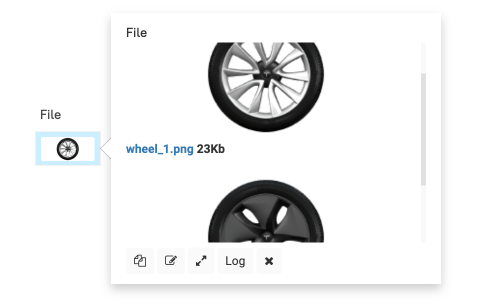
Stores one or more files. Files are located on the server in the folder /http/fls/youdomain.zone and are accessible through the browser's address bar to anyone who knows the path.
In the case of jpg, jpeg, png extensions, image previews of size 290 x Y will be created.
The file is stored in a folder on the server, and the field contains a list with data about the files in the field.
A field list with one file contains one element.
If the multiple values parameter was set and then turned off and the rows recalculated, the extra files already stored in the field are not deleted.
Example content:
[
  {
    "size": 3131,
    "ext": "gz",
    "file": "587_file.gz",
    "name": "wheretest.json.gz"
  }
]
name — the name of the uploaded file.
ext — the extension, taken from the name.
size — the size in bytes.
file — the file name from the folder
$TOTUM/http/fls/youdomain.zone
// Set the cell value by adding a new text file:

example: set(table: 'table_name'; field: 'field_name' = $filesData)
    filesData: listCreate(item: $rowFile)
        rowFile: rowCreate(field: "name" = "Added file.txt"; field: "filestring" = "Content of the added text file")
// Set the cell value by adding a new binary file:

example2: set(table: 'table_name'; field: 'field_name' = $filesData2)
    filesData2: listCreate(item: $rowFile2)
        rowFile2: rowCreate(field: "name" = "Added file.png"; field: "filestring" = "binary content here")

        // also possible in base64: rowCreate(field: "name" = "Added file.png"; field: "filestringbase64" = "base64 code here")
        // binary content by file name can be obtained using the fileGetContent function
// Set the cell value by adding a new file in gz:

example3: set(table: 'table_name'; field: 'field_name' = $filesData3)
    filesData3: listCreate(item: $rowFile3)
        rowFile3: rowCreate(field: "name" = "Added file.txt"; field: "gz" = true; field: "filestring" = "Content of the added text file")
If you use the construction
field: 'field_name' + $filesDatathen with the active multiple values parameter, the file will be added, not overwritten. Only one file can be added at a time. When adding, arowis passed, not arowlist.
Features and settings:
To ensure transaction monolithicity, all file manipulations on the disk occur after a successful commit in the database. This means that the file will be physically written only after all action codes chains are executed!
To access the file content, use the fileGetContent function. Attempting to get data through getFromScript may return old content or null.
Multiple values (multiple).
Duplicate file on copy (fileDuplicateOnCopy).
File name with hash at the end (nameWithHash).
Accepts files
mime-type(accept).
If you encounter that the file is not uploaded to the field — check the PHP parameters
php_admin_value[upload_max_filesize]on the server in thepoolsetting inphp-fpmat the pathnano /etc/php/8.3/fpm/pool.d/totum.conf(php_admin_value[post_max_size]in the pool settings should be =0) andclient_max_body_sizein thenginxsettings at the pathnano /etc/nginx/sites-available/totum.online.conf.Changes are applied after restarting fpm and nginx:
service php8.3-fpm restartandservice nginx restart.
Files in temporary tables
When a file is uploaded to a temporary table, it is created similarly to a file in permanent tables but is marked as !tmp!. These files remain on the HDD and their names are reused after an hour.
If you actively use files in temporary tables and need to clean up remaining artifacts — set the cron command clean-tmp-tables-files-multi.
crontab -e
*/10 * * * * cd /home/totum/totum-mit/ && bin/totum clean-tmp-tables-files-multi
These commands delete files marked with the !tmp! prefix from the HDD, whose last usage time is more than an hour ago.
Unique
A string with uniqueness check within the field of a single table.
Stores a string value of any length or null. When adding or modifying, it checks if the value already exists in the field in the current table.
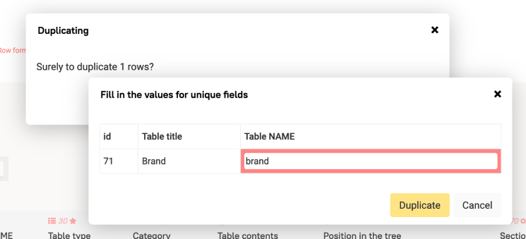
When duplicating, it will prompt to enter a new value.
Web Interface:
Displayed as a string in the cell.
Fully transmitted to the client.
Edited with a simple input field.
Features and Settings:
Password
Storing encrypted passwords.
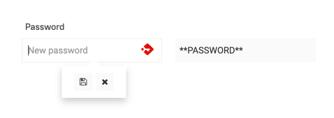
Stores md5-hash or null. When adding or modifying, it saves the md5-hash instead of the entered string.
Web Interface:
Displayed as the string
\*\*PASSWORD\*\*Not transmitted to the client.
Edited using the browser's password input field.
The entered value is not recorded in the Log.
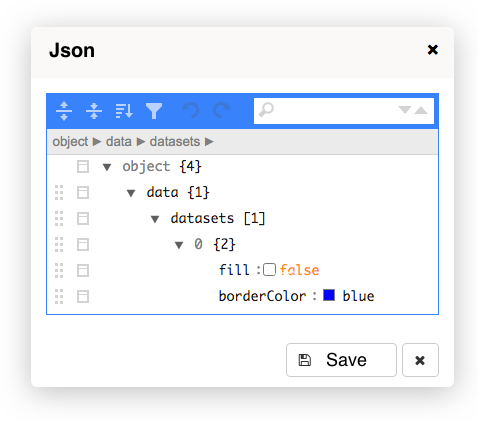
Data
Any data types. Preferably a list or associative array. When editing, a Json-editor opens.
Web Interface:
Displayed as a string in the cell.
If the structure of the stored data contains the keys
settingsanddata, and thesettingfield contains acolumnslist at the top level, it is displayed as a table in the panel by right-clicking.Partially transferred to the client, loaded when editing and calling the panel by right-clicking.
Edited in the
json-editor.
Features and Settings:
To display as a table, the field must have a structure like:
settings
- columns — list with the names of the columns to be displayed.
- headRow
true— to display keys as column headers.- or Associative array — with key and column header mapping for displaying headers.
- headColumn
true— to bold the content of the first column.
data — list of associative arrays with keys listed in
settings["columns"].
Example of field content displayed as a table:
{
  "data": [
    {
      "data": null,
      "type": "Calculated in tree",
      "version": null,
      "with_data": true,
      "table_name": "testglobcalcs"
    }
  ],
  "settings": {
    "columns": [
      "table_name",
      "type",
      "version",
      "with_data",
      "data"
    ],
    "headRow": {
      "data": "String intervals",
      "type": "Type",
      "version": "Version",
      "with_data": "With data",
      "table_name": "Table name"
    }
  }
}
=: rowCreate(field: "data" = $data; field: "settings" = $settings)
    settings: rowCreate(field: "columns" = $columns; field: "headRow" = $headRow)
        columns: jsonExtract(text: '["table_name","type","version","with_data","data"]')
    data: listCreate(item: $row1)
        row1: rowCreate(field: "type" = "Calculated in tree"; field: "version" = "null"; field: "with_data" = true; field: "table_name" = "testglobcalcs")
    headRow: jsonExtract(text: '{"data":"String intervals","type":"Type","version":"Version","with_data":"With data","table_name":"Table name"}')
| Table name | Type | Version | With data | String intervals |
|---|---|---|---|---|
| testglobcalcs | Calculated in tree | null | true | null |
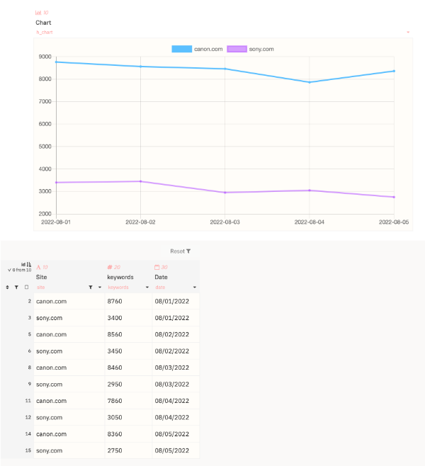
Chart
Displaying charts based on chart.js
The field does not contain data but calculates it before displaying along with the formatting block of other fields.
The necessary data for the chart is collected using the field parameter data for charts.
The result of the code should be an associative array of the following type:
=: rowCreate(field: "labels" = $list_labels; field: "values" = $list_values)

list_labels: #labels

list_values: listCreate(item: $dataset_list_1; item: $dataset_list_2; item: $dataset_list_3)

dataset_list_1: #dataset_list_1
dataset_list_2: #dataset_list_2
dataset_list_3: #dataset_list_3
The labels should contain a list of X-axis labels. The values should be a list of lists with data — datasets.
The appearance settings of the chart are configured in the JSON parameter Chart Settings. To use the preset settings, select the Chart Type and click Fill default settings.
The settings for each data type are defined in the datasets section in Chart Settings. The order of datasets corresponds to the order of lists passed in values.
You can view the chart.js settings documentation here. Data for charts refers to data. Data from data refers to data. Everything else refers to options.
Web Interface:
For the chart to be displayed, the height or maximum height must be specified in the formatting settings of the field or section!
f1=: setFloatFormat(maxheight: 1000)
maxheight : field_name : 1000
The height of the chart depends on the width of the field and the aspect ratio set in Chart Settings — aspectRatio and aspectRatioMobile. The latter is used when the page width is less than 600px along with disabling the grid and axis labels.
The chart can also be displayed in the row part. In this case, Data for charts will be executed for each row.
Features and Settings:
Chart type (chartType).
Chart settings (chartOptions).
Data for charts (codeChart).
Dynamic datasets parameters
Mainly passed in row: field: "datasets_label" = $list_d_labels
The key in row is specified as datasets_PARAM.
Example of chart code:
=: rowCreate(field: "labels" = $list_labels; field: "values" = $list_values; field: "datasets_label" = $list_d_labels)

list_labels: $dates
list_d_labels: $sites
list_values: listReplace(list: $sites; action: $sites_data; value: "sites_data")
    sites_data: $create_data[[$column]]
        column: $#sites_data

~create_data: listReplace(list: $dates; action: $val; value: "date")
    val: rowCreateByLists(keys: $keysList; values: $valuesList)
        keysList: $sites
        valuesList: listReplace(list: $sites; action: $keywords; value: "site")
            keywords: select(table: $#ntn; field: 'keywords'; where: 'site' = $#site; where: 'date' = $#date)

~dates: listUniq(list: $list_dates)
        list_dates: selectList(table: $#ntn; field: 'date'; order: 'date' asc)

~sites: listUniq(list: $list_sites)
    list_sites: selectList(table: $#ntn; field: 'site'; order: 'site' asc)
Field Settings
Field Type (type)
Field type selection. Possible options:
String — a simple string without line breaks. Stores strings
"string".Number — an integer or floating-point number. Stores numbers
5,5.1456.Select — dropdown lists, simple or multiple. For simple, the base stores a string
"string", for multiple, a list["string1","string2"].Select-tree — dropdown tree lists, simple or multiple. For simple, the base stores a string
"string", for multiple, a list["string1","string2"].Checkbox — a checkmark
true,false, ornull.Date — a date or date with time. Stores a string of a specific format
"Y-m-d"or"Y-m-d H:i".Button — a button to perform an action when clicked. Stores
null.Label — quick display of another cell's value. Stores data similar to the parent cell.
Text — text with line breaks and formatting. Stores a string
"string".Comments — similar to a mini-chat with read tracking. Stores a list of lists
[["2019-08-01 13:30",1,"test"]].File — works with files. Stores a list of associative arrays.
Unique — a string without line breaks with uniqueness tracking across the column. Stores strings
"string".Password — processes passwords. Stores
md5strings.Data — stores data of all types.
Chart — displays a chart based on chart.js.
WARNING: when changing the field type, all unsaved changes in the field card will be lost!
Default Width, px (width)
For all field types.
The default field width in pixels in the WEB interface. Default is 100.
Recommended sizes:
- Money —
100 - Large money —
110-120 - Short numbers —
70-80 - Checkbox —
40-60 - Last name, first name, short title —
150-200 - Titles, comments —
250-300 - Short buttons —
40-60 - Medium buttons —
150 - Long buttons —
250-300
Button Text (buttonText)
Only for the Button field.
Text on the button.
It is recommended to fill in UPPERCASE.
Field Name in the Row Part (column)
For all field types. Except Unique.
Field Name binding for pre-filter and footer.
For pre-filter — by which field in the row part the filtering will be performed.
For footer — in the column of which field in the row part the current field will be placed.
Interval (intervalFilter)
For fields of types Date, Number, Select (simple) in the pre-filter placement.
Defines the field type as interval — filter from or to the specified value (inclusive).
Start — filter from the specified value (inclusive).
End — filter to the specified value (inclusive).
Does not apply if the filter field is empty.
Be careful: for columns containing strings or numbers, comparisons will behave differently, as the sorting of strings and numbers differs!
linkTableName
For the field type Label.
Name of the table from which the field value will be taken. Works only in conjunction with linkFieldName.
Using the label field can easily lead to table or group of tables looping.
linkFieldName
For the field type Label.
The Name of the field outside the string part from which the data will be taken. Works only in conjunction with linkTableName.
Using the label field can easily cause a loop in the table or group of tables.
Default Value (default)
For all field types. Except File, Label, Unique, Button, Comments, Password.
The default value that will be inserted into the field when creating a row or table.
Unit of Measurement (unitType)
For fields of type Number, Select (simple), and Select-tree (simple).
The unit of measurement is automatically added to the display with a space after the field value.
If you retrieve the value from the cell using code, the unit of measurement will be absent.
Automatically displayed in the field header.
Show unit before value (before)
For fields of type Number.
Child of unitType.
Displays the unit of measurement before the numeric value.
Currency Format (currency)
For the field type Number.
Transforms the output value 1560.50 → 1 560,50.
It makes sense to use it together with unitType like €
Prefix (prefix)
For fields of type Number.
Child of currency.
Allows you to customize the formatting of the number.
If specified, it overrides the currency setting.
It is possible to specify different values for numbers >= 0 and < 0 using the ** operator.
For example: pref **minus — pref will be shown for positive numbers and zero, minus for negative numbers.
The prefix for negative numbers replaces the - sign.
Thousandth Separator (thousandthSeparator)
For fields of type Number.
Child of currency.
Allows you to configure the number formatting.
If specified, it overrides the currency setting.
It is possible to specify different values for numbers >= 0 and < 0 using the ** operator — before the separator for positive numbers, after for negative numbers. Spaces are significant.
Decimal Separator (dectimalSeparator)
For fields of type Number.
Child of currency.
Allows you to configure the number formatting.
If specified, it overrides the currency setting.
It is possible to specify different values for numbers >= 0 and < 0 using the ** operator — before the separator for positive numbers, after for negative numbers. Spaces are significant.
Postfix
For fields of type Number.
Child of currency.
Allows you to configure the number formatting.
If specified, it overrides the currency setting.
It is possible to specify different values for numbers >= 0 and < 0 using the ** operator — before the separator for positive numbers, after for negative numbers. Spaces are significant.
Rounding (round)
The rule for rounding numbers for the field type Number.
Mathematical— rounds down if less than 5, rounds up if 5 or greater.Upward— always rounds up.Downward— always rounds down.
Rounding step (step)
For the field type Number.
Child of round.
The rounding step with which it will be performed. A fractional value is specified using .
For example:
Original number: `3.43`
Rounding: `Upwards`
Rounding step: `0.15`
Result: `3.45`
Text Type (textType)
For the field type Text.
Determines how the text contained in the field will be formatted when opened for editing.
TEXT — plain text with line breaks. Default option. No markup highlighting.
CSS — with CSS markup highlighting.
XML — with XML markup highlighting.
HTML — with HTML markup highlighting.
JSON — opens a JSON editor.
TOTUM-code — with TOTUM-code markup highlighting.
MARKDOWN — with MARKDOWN markup highlighting.
JAVASCRIPT — with JAVASCRIPT markup highlighting.
Text Visibility Limitation in web (viewTextMaxLength)
For fields of type Text, Comments, and Select (multi).
Limits the text output in the field in the WEB interface and during automatic printing.
Print full text (printTextfull)
For fields of type Text, Select (multiple), Select-tree (multiple), and Comments.
For Select (multiple), Select-tree (multiple) it is a child of multiple.
Prints all the content of the cell, regardless of its size.
Date-Time (dateTime)
For field types Date and Comments.
Switching between Y-m-d and Y-m-d H:i formats.
The Date field does not support seconds. If you need to store time with seconds, use the String field.
Date/Time Display Format (dateFormat)
For the field type Date.
Defines the date display format in the interface. Does not affect the data storage format in the field.
Specified as a string in which replacements will be made:
Characters marked as
display onlydo not work correctly with the datepicker!
d— Day of the month, 2 digits with leading zero from 01 to 31.D— Textual representation of the day of the week, displayed in Cyrillic.j— Day of the month without leading zero from 1 to 31 (display only).z– Day of the year from 0 to 365.F— Full month name.W— Week number of the year (display only).m— Month number with leading zero from 01 to 12.M— Abbreviated month name.n— Month number without leading zero from 1 to 12.Y— Year number, 4 digits. Examples: 1999, 2003.y— Year number, 2 digits. Examples: 99, 03.H— Hours in 24-hour format with leading zero from 00 to 23.i— Minutes with leading zero from 00 to 59.s— Seconds with leading zero from 00 to 59.
Input Validation Format (regexp)
For field types String, Unique, and Number.
An expression in PCRE regExp format, which is matched against the field's input value. If there is no match, the computation is interrupted with an error.
Example
^\d+$ — only positive integers including 0.
^[1-9]\d*$ — only positive integers excluding 0.
^(.+@.+\..+|.{0})$ — email format validation.
Validation Error Text (regexpErrorText)
For field types String, Unique, and Number.
The warning text that will be displayed in a pop-up window as a result of incorrect input value according to regexp.
Copy values on duplicate (copyOnDuplicate)
For all field types except File, Label, Unique, Button, Password, and Chart.
Determines whether the current field values will be copied to the newly created row.
Duplicate file on copy (fileDuplicateOnCopy)
For the field type File.
When enabled, duplicating a row or loop with this field creates a copy of the file with a new name.
If the parameter is disabled, no file copy is created during duplication, and a link to the files contained in the source cell is created instead.
You can create one-way bindings where the recipient field is manually immutable. In this case, the checkbox should be checked in the source field to ensure correct row duplication in the source table.
It should be unchecked when creating mutually updating file fields through the set functions. In this case, file deletion will only be possible in the field where it was added.
File name with hash at the end (nameWithHash)
For the field type File.
If this option is enabled, a random hash will be appended to the end of the file name to make it more difficult to guess the file path.
Secure File Access (secureFile)
If you check the box in a field that already contains files, the connection to them will be lost, but they will physically remain on the server.
If you check the box and save, it will be impossible to uncheck it for this field!
When a file is first uploaded to a field with this setting, a secureFiles folder will be created in the root directory of the Totum installation, which is inaccessible via the http(s) protocol. Files will be saved to this folder.
At the moment when a file is requested by a user, their access rights to this field will be checked on the server side.
If the user:
has access to the table for reading or modification
has access to field visibility
the row is available through prefilters
Then the file will be delivered through the PHP server.
This imposes restrictions on the file size and the load on PHP at the moment of file delivery. The file download time must be less than the maximum script execution time set in Conf.php in the root of the installation.
Set a subfolder for files (customFileFolder)
Child of secureFile.
Sets a custom subfolder at the path /home/totum/totum-mit/secureFiles/YOUR_DOMAIN/CUSTOM_FOLDER
This way you can place files on connected HDD/SSD by creating a symbolic link to the folder.
Divide into subfolder every N id (fieIdDivider)
Child of customFileFolder.
Relevant only for the string part and for File fields inside loops
For files inside a loop, loop numbers are used, not row ids within the loop!
Sets an automatic subfolder for every N id: /home/totum/totum-mit/secureFiles/YOUR_DOMAIN/CUSTOM_FOLDER/0000001
This way you can archive old files on connected HDD/SSD by moving them and creating symbolic links to the folders.
Accepts files (mime-type) (accept)
For the field type File.
If specified, it will accept files with the given mime-type.
Write mime-types and/or extensions with a dot, separated by ,, for example: .ttm
For example, to accept images in jpeg and png, set image/jpeg,image/png.
To accept only files with the extensions .xyz and .hmm, set — .xyz,.hmm.
List of mime-types from Mozilla: https://developer.mozilla.org/...
Required
For all field types except Button, Label, and Chart.
When this element is activated, it prevents saving a field with an empty value.
Similarly, when editing this field, it issues a warning and cancels the save if emptiness is entered.
Be careful when assigning this parameter to existing fields. When executing codes, they will be stopped due to an error if their unit of measure contains an empty field with Required set.
notLoaded (notLoaded)
If set, the value **NOTLOADED** is passed to the table during loading. It is used in cases where fields contain large amounts of information and make it impossible to display a large number of rows on one page.
In such cases, notLoaded drastically reduces the amount of data transferred to the browser.
Show in WEB (showInWeb)
For all field types.
Determines whether to display the field in the WEB interface.
Insertable in WEB
For all field types except Button and Chart.
Child of showInWeb.
Determines whether the field will be available for modification in the addition row of the line part.
Adding available roles (addRoles)
For all field types except Button and Chart.
Child of insertable.
Defines which roles will have access to change the field value in the addition row.
Editable in WEB (editable)
For all field types. Except Button and Chart.
Child of showInWeb.
Determines whether the field will be available for modification in the WEB interface (excluding addition row).
Group Edit (editGroup)
For all field types. Except Button and Chart.
Child of editable.
Determines whether simultaneous editing of multiple cells in one field in the row part will be available.
When other columns are selected (editGroupMultiColumns)
For all field types. Except Button and Chart.
Child of editGroup.
Determines whether simultaneous editing is available if multiple fields (columns) are selected.
Edit available to roles (editRoles)
For all field types. Except Button.
Child of editable.
Determines which roles will have access to edit the field in the WEB interface (excluding add row).
Show Dropdown Menu (dropdownView)
For all field types. Only for fields in the row section.
Child of showInWeb.
Determines whether to show the dropdown arrow in the field header for the user.
The dropdown menu provides the user with access to:
Sorting — A-Z or Z-A.
Hide Field — temporarily hides the field visibility.
Field Width — the width of the field in pixels.
Mathematical Operations — for numeric fields
Sum,Average,Maximum,Minimum,Count of Values.
When pagination is enabled, actions are performed only on the current page.
Filter by Field (filterable)
For all field types except File, Button, Comments, Password, and Chart.
Child of showInWeb.
Activates the filter by column values. Displayed in the field header. Available only in the row part.
You can select one or multiple values.
Identical values are merged at the time of filter invocation.
Not recommended for large tables containing many unique values in the field.
When pagination is enabled, filtering is performed only on the current page.
Maximum number of displayed elements (selectLength)
For the field types Select (simple) and Select-tree.
Child of showInWeb.
Determines the number of list elements that will be loaded into the dropdown list in the WEB interface.
Allows reducing the load on the user's browser when working with large lists.
When the limit is triggered while scrolling to the end of the dropdown list, it will indicate that only a part of the values is shown.
Warning when editing (warningEditPanel)
For all field types. Except Comments.
Child of showInWeb.
Displays a warning window with action options OK and CANCEL.
Warning Text (warningEditText)
For all field types. Except Comments.
Child of warningEditPanel.
Warning text that will be displayed in the warningEditPanel pop-up window.
RegExp for displaying a warning (warningEditRegExp)
For all field types except File, Button, Comments, Password, Checkbox.
Child of warningEditPanel.
A warning will be displayed only if the entered value matches the specified regular expression.
Display string as URL (url)
For field type String, Unique.
Child of showInWeb.
In the WEB interface, formats the value in the field as a hyperlink.
From a new line (tableBreakBefore)
For all field types. Except Unique. For header, pre-filter, and footer.
Child of showInWeb.
Moves the field to the next line.
Title (sectionTitle)
For all field types. Except Unique. For header, pre-filter, and footer.
Child of tableBreakBefore.
Sets the section title, which can be clicked to collapse the section along with all its fields. This field also records the parameters of sections.
Panel Color (panelColor)
For all field types. Except Unique.
Child of showInWeb.
Defines the fill color of the field's header and body. Specified as a HEX value #ff00cc. Or as an HTML color name, for example — tomato.
For headers, it is recommended to use light colors.
Has an advantage over field formatting in speed, as it is not calculated on the server side.
Recommended fill colors that match the overall Totum design:
OldLacePapayaWhipPeachPuffLightSalmonTomatoGreenYellowLavenderOrangeRoyalBlueSteelBlueMagentaMistyRoseBeigeFloralWhiteWhiteSmokeGhostWhiteAliceBlue
Decoration Color
For the field type Comments.
Defines the color of the underline for unread comments for the user.
Visible to roles (webRoles)
For all field types.
Child of showInWeb.
Defines the roles that will see this field.
If only Creator is selected, the field header will be highlighted in red-pink.
If at least one role is selected, data from the server will only be transmitted to users possessing that role.
With logging
For all field types. Except Button.
Enables recording of changes made in the WEB interface into the system logging table.
If enabled, the following information will be recorded:
Date-time
User Id
Action type — modification or addition.
Entered data
Field value after modification
To record automatic actions in action functions, the parameter log: true must be specified.
Log available to roles (logRoles)
For all field types. Except Button.
Child of showInWeb.
Determines which roles will have access to the action log for the field.
Access to the log is provided by right-clicking on the field, then selecting the Log button in the dropdown panel.
In addition to access to logs for a specific field, the role must have access to the table Table structure for log output.
To record logs through the WEB interface, the logging parameter must be enabled.
To record automatic actions in action functions, the log: true parameter must be specified.
Context Panel Width (contextPanelWidth)
For all field types.
Child of showInWeb.
Makes the context panel wider by + 100px and + 200px for a specific field when right-clicked.
PRO Dynamic Field (dynamic)
Available only in PRO and only for field types String, Number, Data.
Show in another place (showInWebOtherPlace)
For all field types.
Allows displaying the field in another placement and with a different sort.
The calculation order remains unchanged.
Other Placement (showInWebOtherPlacement)
For all field types.
Child of showInWebOtherPlace.
Allows displaying the field in another placement.
Other sort (showInWebOtherOrd)
For all field types.
Child of showInWebOtherPlace.
Allows displaying the field with a different sort.

Other Name (showInWebOtherName)
For all field types.
Child of showInWebOtherPlace.
Allows displaying the field with a different name, for example, to display a field from the header or footer in the footer-columns.
Show in API (showInXml)
For all field types. Except Button.
When this option is enabled, the field values will be returned via the json interface upon request.
API Insertable
For all field types except Button.
Child of showInXml.
When enabled, the field value can be set through the JSON interface when creating a record.
Editable in API (apiEditable)
For all field types. Except Button.
Child of showInXml.
When enabled, the field value can be changed through the json interface.
Editing in API available to roles (xmlEditRoles)
For all field types. Except Button.
Child of apiEditable.
If roles are selected, editing through the json interface will only be available to json users with these roles.
Visible to roles in API (xmlRoles)
For all field types except Button.
Child of showInXml.
If roles are selected, viewing the field through the json interface will only be available to API users with these roles.
Adding and editing the field will be prohibited for roles not included in this list, even if they are listed in apiEditable/apiInsertable.
Code
For all field types except Label, Button, Comments, Password, and Chart.
A code section that calculates the value in the field at the moment of recalculating the recalculation unit.
When entering a value manually, the value in the field is divided into calculated and manual — an indication with a hand appears.
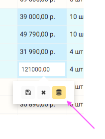
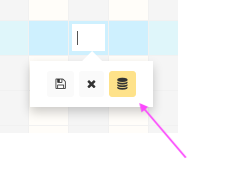
Open hand — the value is set manually and differs from the calculated one.
Closed hand — the value is entered manually and is identical to the calculated one.
If there is a manual value, it is used for subsequent calculations instead of the calculated one when the field is accessed in the standard way.
Execute code only on add (codeOnlyInAdd)
For all field types except Label, Button, Comments, Password.
Child of code.
When this parameter is enabled, the code will only be executed in the add row, when adding through functions like insert() or when creating a table.
Subsequent manual input of values does not differentiate between calculated and manual values.
It is possible to re-execute the code with the "only on add" parameter by calling the recalculation function reCalculate with the
field:parameter.
Error Text (errorText)
For all field types except File, Label, Button, Comments, Password.
Child of code.
If there is an error in code, the value in the field is displayed as ERROR!.
The value in this setting replaces ERROR! → Entered text.
Used to remove the display of non-critical errors for users. For example, division by zero during incomplete data entry can be replaced with Enter data or Select interval.
Code Action
For all field types.
A code section that performs actions based on conditions.
Execute code action on add (CodeActionOnAdd)
For all field types. Except Button.
Child of codeAction.
Triggers the execution of a code action when a row is added and a loop is created.
Execute code action on change (CodeActionOnChange)
For all field types. Except Button.
Child of codeAction.
Triggers the execution of a code action when the values in the field change.
Execute Code Action on Delete (CodeActionOnDelete)
For all field types except Button.
Child of codeAction.
Triggers the execution of a code action when a row is deleted.
Upon deletion, the current field value through #nowfieldname and $#nfv equals null. If you need to retrieve the last value, you should refer to it through #old.nowfieldname or $#onfv.
See more about referencing field values.
Execute code action on click (CodeActionOnClick)
For all field types. Except Button.
Child of codeAction.
Triggers the execution of the code action on double-clicking a locked cell.
Format click as URL (CodeActionOnClickAsUrl)
For all field types. Except Button.
Child of CodeActionOnClick.
Formats the value in the field as a URL, upon clicking which the action is triggered by CodeActionOnClick.
Allow action in read-only mode (AllowActionClickOnRead)
For all field types. Except Button.
Child of codeAction.
Allows action for roles with read-only access mode to the table.
Uncheck After Click (uncheckAfterClick)
For the field type Button.
Child of codeAction.
If checkmarks were set in the id column of the row part, they will be removed after the successful execution of the action code.
In case the code execution ends with an error or errorException, this action will not be performed.
The IDs of the rows marked with a checkmark can be obtained using the quick variable $#ids. Only for action codes.
Close window after execution (closeIframeAfterClick)
For the field type Button.
Child of codeAction.
If the button is clicked in a popup iframe, the window will close after executing the action code.
If the code execution results in an error or errorException, the window will not close.
Using this in a button that triggers linkToButtons or linkToInput will cause them to malfunction! Use the
close: trueparameter within these functions instead.
Action available on view (pressableOnOnlyRead)
For the field type Button.
Child of codeAction.
Allows pressing the button for roles that have read-only permissions on the table.
Enable button in the insertion row (buttonActiveOnInsert)
For the field type Button.
Child of codeAction.
Makes the button available in the insertion row.
Allows, together with the use of the insertion row hash variable $#ih, to call a [temporary table] and then return data from it to the insertion row field using the hash parameter of the set function. Alternatively, it can execute set in the insertion row field without calling the temporary table.
Open Context Panel (openContextPanel)
For the field type Button.
Child of codeAction.
Opens the field's context panel upon completion of the code action. The panel will open even if the code action contains only =:.
Code Select (codeSelect)
For the field types Select and Select-Tree.
The code that forms the display of the bases contained in the field.
For the Select field from the =: section, the result of the selectRowListForSelect function or a similar format should be returned.
For the Select-Tree field from the =: section, the result of the selectRowListForTree function or a similar format should be returned.
Individual calculation of select for each row (codeSelectIndividual)
For the field types Select and Select-tree.
Child of codeSelect.
Determines whether the list of options for the field will be calculated once when the table is opened or if it needs to be calculated individually for each row.
For example, if different rows can have different sets of options depending on the values of other fields.
This parameter also determines whether the options for select fields will be recalculated when the values of fields in the table change.
Resource-intensive operation! Especially if the table is large or the selection of options comes from a large table. Do not enable without real necessity!
Check entered values on the server (checkSelectValues)
For the field type Select and Select-tree.
Child of codeSelect.
If enabled, at the moment of saving the value on the server, the code-select will be calculated and the available values will be compared with the entered value. If the entered value does not fall within the calculated range, the saving will be canceled, and the user will be shown an error indicating the invalidity of the entered value.
Replaces manually written action code that checks valid values.
If disabled and there is no protective action code, the user can save any value in the select field on the server regardless of the available values.
Resource-intensive operation! Do not enable without real necessity!
Multiple Values (multiple)
For field types Select, Select-tree, and File.
Child of codeSelect.
For select and select-tree, it determines whether the field base will contain a single value or a list. For file, enabling this removes the restriction on a single item.
Be careful when changing this parameter in a field that already contains data (except for the File field type), as this action leads to a change in the data storage format.
If you change from
singletomultiple, you will need to recalculate all rows with data in this field. If changing in the opposite direction, some data contained in multiple values will be lost.
Multi-value Separator (multiSeparator)
For field types Select and Select-tree.
Child of multiple.
Defines the separator for values displayed in the field.
Multiselect View in Cell (multySelectView)
For field types Select and Select-tree.
Child of multiple.
Determines whether multiselects will be displayed in the WEB interface or N values will be shown.
Display path in cell (treeViewTypeFull)
For the field type Select-tree.
Child of codeSelect.
Determines whether only the final value or the entire path will be displayed.
Tree is built from a single table (treeAutoTree)
For the field type Select-tree.
Child for codeSelect.
Selected if the values of the tree folders are contained in the same table and field (column) as the values.
If unchecked, it means that the tree structure is in one table, and the values are in another.
Calculation Order in tree (treeViewCalc)
For the field type Select-tree.
Child for codeSelect.
Bottom level first— in this mode, the bottom-level rows are calculated first.Top level first— in this mode, the top-level rows are calculated first.
Works only for the tree type
By another table
Folders can be selected (treeSelectFolders)
For the field type Select-tree.
Child of treeAutoTree.
Determines whether intermediate tree values can be selected as the field value (whether folders can be selected).
PRO Tree View Type (treeViewType)
Only for PRO version
For the field type Select-tree.
Only for the field with name = tree. It is a key parameter — when enabled, the row part of the table will be displayed as a tree.
Load all (treeViewLoad)
For the field type Select-tree.
Child of treeViewType.
Only for the field with name = tree.
If enabled, all tree values will be loaded when the table is loaded.
If disabled, the tree will be loaded in a collapsed state and only segments expanded by the user will be loaded.
Formatting for tree folders (treeViewCode)
*
Hide Add button (treeHideAddButton)
For the field type Select-tree.
Child of treeViewType.
Only for the field with name = tree.
If enabled, the Add button at the top right of the row part will be hidden. Only the buttons in the dropdown menus in the branches will remain.
Open all (treeViewOpen)
For the field type Select-tree.
Child of treeViewLoad.
Only for the field with name = tree.
Opens all tree segments when the table is loaded.
If treeViewLoad is enabled and treeViewOpen is disabled, the tree will be fully loaded but displayed in a collapsed view.
Name of the parent field (treeViewParentField)
For the field type Select-tree.
Child of treeViewType.
Only for the field with name = tree.
If not filled, it is used as tree.
It is necessary to specify if the parent parameter in the tree-view select code indicates a field different from tree.
Name-field for bfield (treeBfield)
For the field type Select-tree.
Child for treeViewType.
Only for the field with name = tree.
If not specified, id is used.
It is necessary to specify the name of the field if the bfield parameter is used in the select code for tree.
All (*ALL*)
For the field type Select and Select-tree in the placement pre-filter.
Child of codeSelect.
Determines whether the value \*ALL\* will be available to display all values of the field's string part.
Title for the All (*ALL*) option
For the field type Select in the pre-filter placement.
Child of selectFilterWithAll.
Defines the display text.
None (*NONE*)
For the field type Select and Select-tree in the pre-filter placement.
Child of codeSelect.
Prohibits selection for the entire pre-filter, even if it is contained in only one pre-filter field.
Used for large tables to speed up their initial display or to prohibit the display of table data by roles or users.
Must be selected for multiple. Because when unchecking all values, it automatically switches the select to
*NONE*.
Title for the None (*NONE*) option
For the field type Select in the pre-filter placement.
Child of selectFilterWithNone.
Defines the display text.
Empty () (selectFilterWithEmpty)
For the field types Select and Select-tree in the pre-filter placement.
Child of codeSelect.
Allows selecting empty values.
Title for Empty Option () (selectFilterWithEmptyText)
For the field type Select in the pre-filter placement.
Child of selectFilterWithEmpty.
Defines the display text.
Title of the select with an empty value (withEmptyVal)
For the field type Select and Select-tree.
Child for codeSelect.
Without this parameter, it is impossible to select an empty value for a simple Select and Select-tree as only items with values will be present in the dropdown list.
Activating this parameter sets the display for the null value or empty list and adds it to the dropdown list.
Select Table for Modification (selectTable)
For field types Select and Select-Tree.
Child of codeSelect.
Defines the table for remote addition/modification of data from the display table (blue buttons when opening the field for editing).
Opens a row in the remote table for modification in the form of a panel.
BaseField other than id (selectTableBaseField)
For field types Select and Select-tree.
Child for selectTable.
Specifies the name of the field in the source table in cases where the select is built using bfield.
Select Panel for Modification (selectTableAction)
For field types Select and Select-tree.
Child of selectTable.
Accepts code to call the select modification panel in the form:
=: linkToPanel(table: ''; id: ; field: )
Where:
table — name of the source table.
id — value of the
idof the source row to be opened in the panel.field in the format
'name' = $value— pre-filled fields when adding a value.
Example
example: linkToPanel(table: 'goods'; id: #fieldname; field: 'category' = "box"; field: 'size' = $size_of_box)
size_of_box: if(condition: #param1 = true; then: 1; else: 2)

// In this code, when clicking on the blue plus, the addition panel in the goods table will
// be pre-filled in the fields category = "box" and size = 1 or 2.
Manual creation of select (values)
For the field type Select.
In the json form, it is proposed to fill in a key-value structure for rendering the select.
You can use numeric and string bases.
Conditional Cell Formatting (format)
For all field types.
Section of the conditional formatting code. Expects the return result of the setFormat function from the f1=:, f2= sections, etc.
Results are applied according to the number in f. Numbers are processed as strings, so it is possible to insert conditions between existing ones by adding a level of digit f1=: < f12=: < f2=:.
In addition to f, the prefix p can be used, which will be executed when the panel is opened by right-clicking on the field. It is numbered similarly to f. Works with formatting functions with the panel... prefix:
panelButtons() — places additional buttons on the panel.
panelImg() — places an image on the panel.
panelHtml() — displays html on the panel.
Field Description (help)
For all field types. Supports html. Displayed in the field header as i. Automatically expands when the focus moves to the field in the add row.
If you need to add an internal technical description of the field that is not accessible to users, enclose it in the <admin>...</admin> tag.
If the description uses text only within the <admin> tag, then i will be shown only to the Creator.
If you pass the <hide> tag before the text, the description will not automatically expand when the focus moves to the field in the add row.
Chart Type (chartType)
For the field type Chart.
Defines the basic setting for loading into Chart Settings.
Chart Settings (chartOptions)
For the field type Chart.
A JSON field of the form:
{
  "data": {
    "datasets": [ -- list, each line defines how the data from values in codeChart will look
      {
        "fill": true, -- fill
        "type": "line", -- chart type (line | bar)
        "yAxisID": "y-axis-1", -- which axis it belongs to
        "borderColor": "tomato", -- line color
        "backgroundColor": "#ff63474a", -- fill color
        "label": "Revenue, rub.", -- label
        "borderWidth": 2 -- line thickness in px
      },
      {
        "fill": false,
        "type": "bar",
        "yAxisID": "y-axis-2", -- using the second axis
        "borderColor": "#ff861c98",
        "backgroundColor": "#ff861c98",
        "label": "Orders, pcs."
      }
    ]
  },
  "legend": {
    "display": true -- show legend or not
  },
  "scales": {
    "yAxes": [
      {
        "id": "y-axis-1", -- axis name
        "position": "left" -- axis position
      },
      {
        "id": "y-axis-2",
        "position": "right"
      }
    ]
  },
  "elements": {
    "line": {
      "tension": 0.000001, -- rounding of chart points
      "borderWidth": 1 -- default line thickness of the chart
    },
    "point": {
      "radius": 1 -- radius of chart points in px
    }
  },
  "aspectRatio": 2, -- aspect ratio for wide screen
  "aspectRatioMobile": 1.5 -- aspect ratio for mobile version less than 600px
}
Documentation on chart.js settings can be found here. Chart data refers to data. Data from data refers to data. Everything else refers to options.
Data for Charts (codeChart)
For the field type Chart.
The field does not contain data but calculates it before displaying along with the Formatting block of other fields.
The result of the code should be an associative array of the following form:
=: rowCreate(field: "labels" = $list_labels; field: "values" = $list_values)

list_labels: #labels

list_values: listCreate(item: $dataset_list_1; item: $dataset_list_2; item: $dataset_list_3)

dataset_list_1: #dataset_list_1
dataset_list_2: #dataset_list_2
dataset_list_3: #dataset_list_3
In labels, a list with marks on the X-axis should be passed. In values, a list of lists with data — datasets.